
Allbirds, Allboring
Why adopting clichés as your brand concept leads to the eventual collapse of your company.

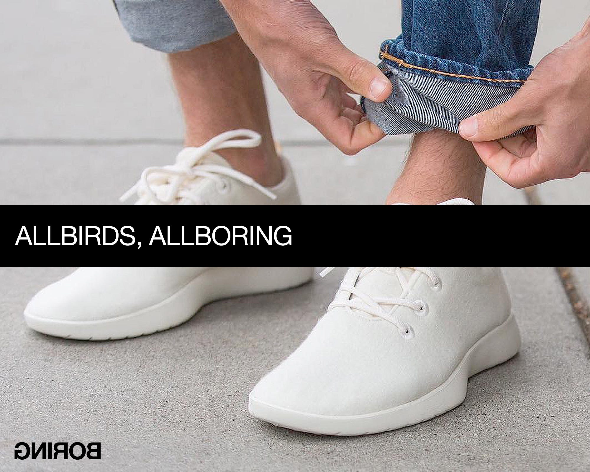
Allbirds is so boring, people stopped buying their shoes, and the company went from a £4 billion (B!) valuation during the pandemic to $40 million (M!) last week.
So, what exactly is so boring about Allbirds?
Funny you should ask. I actually wrote an Allbirds brand analysis for an investor a couple of years ago, when the share price had already dropped about 10x from its peak and value investors started being interested.
Now that the value destruction has been quantified (a 100x drop before going private) it’s worth revisiting what I wrote, in the hope that others (i.e., you) don’t fall into this trap.
Allbirds is one of the best examples of a purpose brand riding on the back of sustainability.
Now, I’m not here to say sustainable businesses can’t survive. What I will say, is that it’s not a brand concept you can own. “We’re sustainable” isn’t something that’ll make you unique, or bring you any kind of differentiation in the long term. In fact, it’s the kind of concept that will—by your very own agenda—condemn you to become a commodity: logically, if you really want the world to go your way and other businesses to do the sustainable thing, you can quickly see where your problem is going to be: they’ll all compete against you on the same terms.
So, clichés like “we’re sustainable” are basically intellectual commodities. And, as much as you might mean them, there’s nothing to stop people with bigger budgets from pulling the green-washed carpet from under your feet.
Which means you’ll inevitably end up in an “out-agreeing each other” scenario:
—”Ah, but we’re 𝘮𝘰𝘳𝘦 sustainable!”
—”No, we’re even 𝘮𝘰𝘳𝘦 sustainable!”
This, when the goal of a brand is to show the consumer how different you are to everyone else. How can you be different if you all agree with each other?
What’s more, Allbirds made a point of not looking particularly distinctive either. Which made sense for a short while: people in Silicon Valley wore Allbirds to signal that sustainability was more important to them than logos. Great, but it still doesn’t solve the problem of what these signals should look like. Signalling no importance to logos is still signalling!
For example, many years ago, when Asprey expanded from jewellery to become a lifestyle brand, they didn’t want to put their logo on the menswear labels: the only name that should appear in a gentleman’s jacket is his own. Fine, but then how do we know it’s an Asprey jacket? The solution we advocated was a purple stripe lining, which later went on to become a distinctive brand asset: Asprey later released the purple Stripe bag, the purple Stripe tea set, etc. Even the GMT line on the Asprey watch was a purple stripe.
Our rationale for the stripe was simple: from pinstripe suits to school ties and rugby shirts, stripes are the minimal aesthetic unit that conveys Englishness. So, the simplest and most understated way to express the ultimate authentic English lifestyle brand whose brand colour was a royal purple should be… purple stripes.
Understated is not another word for bland. But bland, unfortunately, is the one aspect showing just how much Allbirds was a product of its time—the age of blanding—when dozens of fashion brands thought it was a good idea to just write their name in the same sans-serif typeface as everyone else.
The lesson here is simple: don’t be boring, even (especially!) when boring is fashionable.